Visual Brainstorming with AI
Art is an act. This has two contradictory meanings, but in this case, they are unified. “An action, in the world, real” and “a performance”. Real and a performance, particularly when we are under its spell. (MASKS)
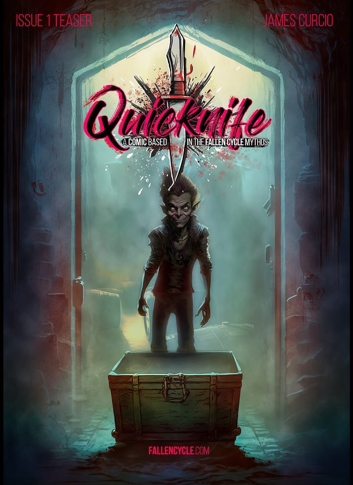
Several people have asked me if I would share more how I’ve been integrating AI with my existing illustration process. The truth is, I’m not entirely convinced that anyone actually reads process posts, so I figured I’d never get around to it. I have a lot else that I should probably do, and not many resources lately.
But then I decided to do it anyway. Much of this work is from early 2022, but I finally got around to typing it up. I hope you get some use out of it.
This’ll be a walkthrough of my workflow from an initial idea to a solid concept. That is of course the point where the work begins, not where it ends.
Before beginning, I feel like I need to explain my approach for this post. I initially considered trying to share a more step-by-step process, but quickly discovered (remembered) why that would likely be a fool’s errand. Although my overall process has become pretty consistent, the illustration “zone” itself is often a series of ADHD hyperfocus memory holes.
So it goes.
1. Conceptualization
Idea Generation:
- Devour related media and information. Discover and rediscover your characters and the world they inhabit.
- Build an “Idea Web” around the project.
- Create mood boards, collages, and sketchbook daydreaming.
Character Development for “Quicknife”:
- Initial research and inspiration from other media, myth, lit, etc.
- Hand sketching for face and character traits.
2. Early Visualization
- Utilization of Midjourney (MJ) for visual brainstorming.
- Generating initial digital thumbnails using text prompts.
- Iterative adjustments based on emerging preferences.
3. Refinement and Hybridization
- Fusion of hand sketches, digital renders, and text prompts.
- Additional pencil sketches to direct MJ towards desired character aesthetics.
- Generating new thumbnails and iterations.
4. Character Sketching and Prompting
- Create a digital ink and color pencil sketch for image prompting.
- Generate a new round of MJ thumbnails.
5. Concept Painting
- Initial concept painting to capture character “vibe”.
- Incorporation of real-world inspiration or other source into the flow (e.g., cat Talin).
6. Character Design Sheet Creation
- Generation of multiple image series through MJ.
- Selection and photobashing of favorite thumbnails and sketches.
- Finalization of character design sheet through hand illustration and digital tweaking.
7. Comic Page Mockup
- Jumped into comic page mockup even before complete script or location concept. (Not typical SOP).
- Initial mockup page creation.
- Detailed work in Photoshop over several months to finalize the teaser comic pages.
- When it’s “done” let it sit a while, and then come back to it for further development.
Concept
For this example, I’ll use the early stages of development for a Fallen Cycle comic, Quicknife (the working title), loosely based on a character I’ve been playing around with in several RPGs. It’s a perfectly goofy idea, I’m sure, with no particular deadline to begin with.
It’s pretty rare that you’re going to be in a position to jump right into illustrating a comic from a dead stop. First step would be to do some concept art of the character(s) and elements most critical to a given script. This often runs alongside ongoing script writing and editorial, but in this case I had no deadline, so that wasn’t necessary, and so I was able to spend several months just playing around with visual ideas.
The first stage in almost any project I take on is an opportunity to devour as much media and information I can that’s already out there that seems to overlap with the project’s “Idea Web”. That’s true for me whether I’m working on an album, a nonfiction book, or a comic, although what that’ll look like differs from one project to the next.
While the method may differ depending on the medium(s) I intend to work with, and the overall context, I have always done this through research, moodboards, collages or full bricolage, lists of other sources of media that are inspirational or support the illustration “problem” I’m looking to solve, and of course daydreaming in sketchbooks.
Midjourney has demonstrated itself to be a very useful tool for this sort of early visualization, within the context of the other methods I’ve been employing for years. The primary use risk for someone like me seems to be that it may help you generate so many ideas and different directions that it can lead to paralysis rather than facilitation. To keep that to a minimum, at this stage I’ve found it’s best not to get overly attached to anything. Chase down tangents, but don’t overcommit to any of them yet.
I had an art professor at college who spent several years of his life focusing on his version of Tibetan sand paintings — an intricate construction that was always destroyed at the end. One of the takeaways that he passed on to me is that in a procedural sense, your function as an artist is not in the techniques you develop, those are merely means to an end. The fundamental element is the choices you make. This direction, and not that one, this color, and not that.
The iterative function of programs like MJ seems to work on this concept — the choices you make are a stronger guiding hand than you realize. Randomization and iteration is a powerful combination in the right context, as any geneticist can tell you.
I’m not saying I haven’t formed some connection with the creative projects I’ve lived and worked with for years, although all else aside, it’s a point of creative hygiene to strive to be a little less precious about it. Our attachment to a pre-conceived, specific outcome or result can be a limitation on the choices we consider taking in the present. In other words, in the early stages, allow for the possibility of the unexpected.
In this case, I know the character, and Highmount and the larger world and history is already established. I conceived the teaser comic with a relatively simple set and character list in mind — no extended action sequences, a lot of “walk and talk,” and a lot of location art. There are three major characters I imaged would appear enough to demand some initial concept work: the Karlu-chatil or “goblin” named Quicknife, his human companion Talin, and the head of a shadowy organization that won’t be fully explored in the first issue I have outlined, though he will likely appear briefly in the final event scene.
(For those who backed my Tales From When I Had A Face kickstarter last year and read the Limited Edition, I’m intending to stage this comic mostly in Alterran, during the time of the “Silverhand” revolutions in Chernaya. The identity of that “head of a shadowy organization” shouldn’t be hard to guess.)
I spent several years on this first stage alone for Tales, so I felt pretty comfortable jumping right into thumbnailing with Midjourney without much additional research. It gave me an opportunity to do some additional research into late Ottoman architecture, and come up with interesting hybrids between the loosely Victorian “coalsmoke” industrial thing with Ottoman and Slavic influences. However, for this blog post I’ll keep it to the lead character.
My initial Quicknife visualization experiments iterating using pure text prompts were interesting, but tended to veer either too elfin or too goblin. As a character, he is in part a synthesis of Arya Stark, Gollum, and Ed from Cowboy Bebop. All of them wound up factoring into generating his likeness as well, at least to some extent.
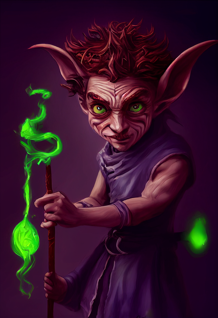
Raw MJ 3 output, too Gnomish

Raw MJ 3 output, too Fey
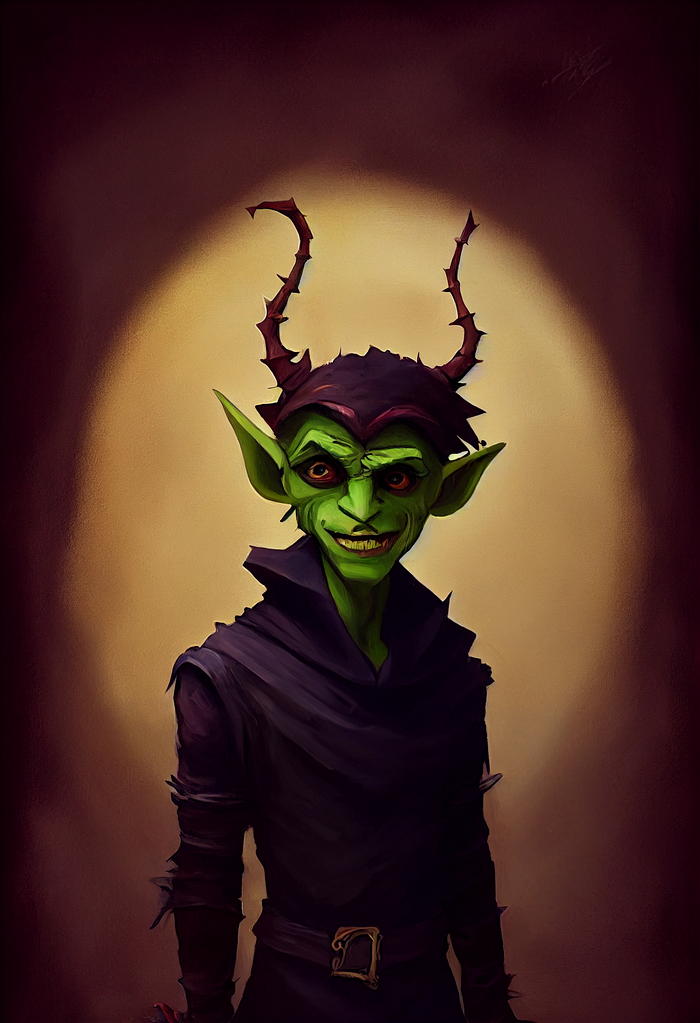
Raw MJ 3 output, too gobliny though getting slightly closer
…And so on…
I intend Quicknife to have a somewhat mercurial appearance, both literally, and in the sense that he also can at times appear kind of fey and even cute, and at other times, like a goblin that slinks out of a child’s closet at night. But I want him to be recognizable as the same character.
To help direct the algo in the right direction, I did several pencil sketches by hand to give it the shape of his face, and ultimately fixated on one to include in the prompts I had decided upon for him through trial and error, including a number of simple style and character description tags. (“Manic androgynous Fey goblin:: rogue, warlock, street urchin, Arya Stark, Gollum, Ed from Cowboy Bebop::.8 in the style of…” and so on). Get familiar with weighting and the vernacular of whatever system you’re using, and again, don’t get attached to this stuff, it’s just grist for the mill.
So now I had a series of iterated thumbnails based off my sketches that were headed in the right direction. After hybridizing all of these elements — pencil sketches, photograph / reference source, text prompt guides tweaked throughout the iteration process using the Remix function — I did a quick ink and color pencil “paintover” sketch with the stylus to use as the guide for subsequent image prompts.
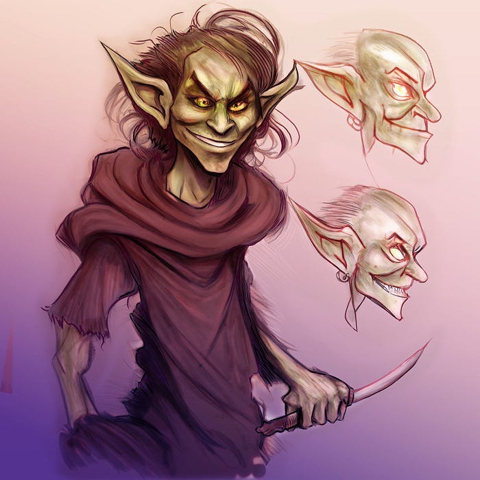
From this, I generated another round of comps. Eventually, I felt that I had enough of an idea of him in a couple different guises. Time to do an initial concept painting. But a session or two in, I still felt like it was still missing some vital ingredient.
Our cat Talin, whose extreme cattitude is also one of several inspirations for the character, gave me the final piece. I caught a couple pictures of him being himself — a total freak, in other words — and ran some prompts that integrated those hybrid renders with his image.
(It’d be a spoiler to say why the cat is named after Quicknife’s friend).
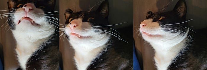
He just lies around like this. There’s a reason I call him “goblin”.
Without making Quicknife look like a cat, I was able to bring in some of his demeanor and especially his eyes through multi-image prompting.
After a few sessions with the stylus in Photoshop:
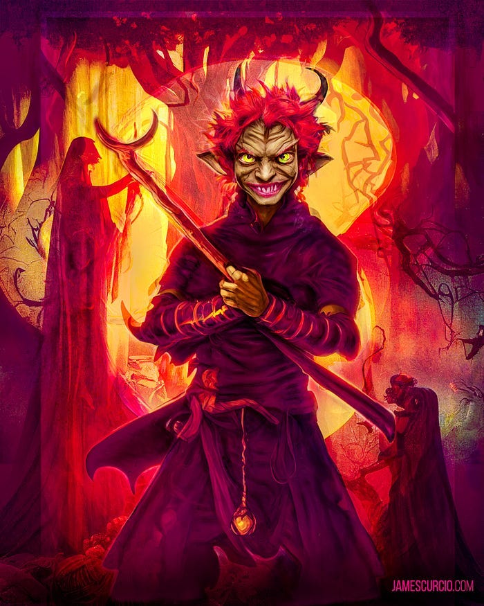
First character “vibe” painting
Now we had something that more closely resembles our sneaky, slightly manic little anti-hero, although this would be him a bit further along in the timeline. I wasn’t especially concerned with the details, as it’s much more of a “vibe” reference. (I did however use a section of it for his character art in some subsequent RPG sessions.)
Character Design Sheet
The next step was to work up a design sheet showing Quicknife as he would appear in this first issue, when he was still a street urchin, cutpurse, and all-around rascal. I began with a cropped head closeup from that painting as my image prompt, along with some new, quick and messy pencil sketches to tell Midjourney what perspective and expression to use.
This led to the generation of several full series of images that were getting closer to my vision of Quicknife in this first proof of concept / teaser.
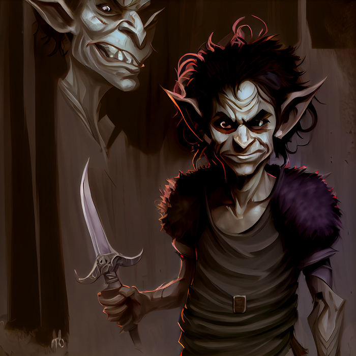
MJ3 raw render (using various image source), trying out a slightly more sinister guise
The final step was to take a step back, pick some favorites, look through all the thumbnails and sketches, and photobash a “character one sheet” with multiple images of Quicknife in a range of relevant styles and moods. I did a little painting and sketching in the process of putting it together, but the initial focus was on placement, and working through those hundred and one decisions you have to make in the process of building a composite image.
Once the layout of the composite was more or less finished, with some quick hand-illustration passes and fixes, I followed my normal process, which is to set the photobashed underpainting composite to ~40% opacity on top of a base tone and/or gradient, and then do a lot of drawing by hand with the stylus + cintiq.
Normally, this stage might be anywhere from a few to over thirty hours for something like a cover painting, during which I cycle back and forth between different brushes/mediums focusing on value (relative lightness/darkness), and lighting within the scene, which can have a profound effect on the appearance of colors. If anyone remembers the “is the dress blue or gold?” kerfuffle on the internet, that’s an example of this principle. That said, on the design sheet I mostly worked with the mentality of inks and color pencil, which is fairly straightforward.
Because a design sheet is mostly for my own future reference, I only spent a couple hours on this one, and didn’t bother to fix every detail. My goal was to capture the character in a couple different poses, styles, and expressions. Was still on the fence about hair color and style so I tried a couple different options.
Once I had something I was mostly happy with, I brought it into Lightroom for a quick post- pass, and viola! Good enough to get started on the next stage.
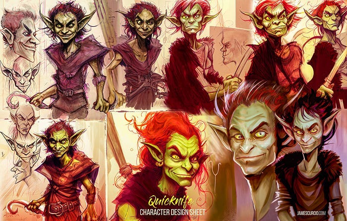
Finished first character design sheet
I was so inspired by the design sheet process that I wound up jumping into mocking up a page as if it was the final comic, before I’d done location concept, or written a proper script. This isn’t my normal MO, but sometimes you’ve got to hammer when the iron is hot.

Initial mockup page, throwing a bunch of ideas up and seeing what sticks.
Thoughts on AI art techniques:
I’ve talked about this at length within the context of the “bigger picture” in various posts, articles, and interviews over the past few years. But not so much on methodology. For now, I can only give a few tidbits… hopefully at some point in the future there’ll be space to get into the weeds with this a little more.
Being a sounding board and thumbnail generator for character and location design sheets is the tip of the iceberg, where AI visualization technology is concerned.
Play with it, with the idea that it is the beginning of a process, rather than an end in itself. Never consider its outputs a final product, aside perhaps for use in private RPGs.
Don’t be afraid to iterate, and then iterate some more. Experiment with new directions! That’s one of the greatest strengths of this particular implementation of the technology, as now you can see a mockup of an idea in a fraction of the time it might have taken before.
That does not however mean that it has likewise turned all illustration into a button push process… I may have more styles available to me today than I did 10 years ago, but the process of building a page of a graphic novel or cover painting is no less involved or ultimately time-consuming than it once was. The goalposts have simply shifted somewhat.
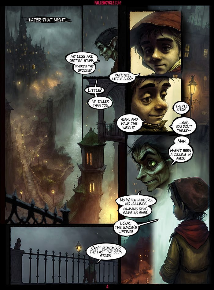
Below you can see the first page as it appears in the teaser comic, after several months of work in Photoshop. A few lines remain from the initial mockup, and some of the flow of the page, but a lot else is changed.
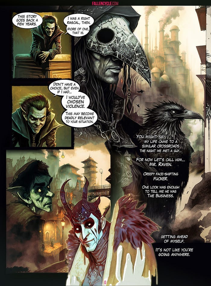
My intention with the 10 page “teaser comic” is to use it down the road to help launch a Kickstarter to raise the funds to properly produce a full issue, or fate willing, short graphic novel. I have several other similar short comics in production now, the theory there being I’ll pick the best out of the group to invest that kind of effort into.
Theory doesn’t always meet practice, especially these past few years, but that’s the intention at any rate.
A note on nomenclature: I am very dissatisfied with “AI” used in this context, however, “MLA” or Machine Learning Algorithm inevitably has people thinking I’m talking about Modern Language Association style guides, no one except people who actually work in the space seem to know what an “LLM” is (Large Language Model), and when I used “Ai” to at least imply that its “intelligence” is quite certainly of the lower-case sort, people thought I was talking about Adobe Illustrator… so I guess I’m stuck with it.
Just understand when I say AI, that it isn’t actually “intelligent” in the way that most would use that word, and it isn’t an “it” in the sense that it is like something to be a machine learning algorithm.
Furthermore, there are also a number of different approaches and applications of/for AI, and outcomes that are contingent on who is using and it for what. Conflating them together is hardly done in the service of clarity. But you know, whatever, it’s fiiine. Most importantly, I’d like to get across the idea that AI is already an integral part of the applications digital artists such as myself work with on a daily basis, and it does no one any service to conflate all uses of AI as equivalent.
